How to choose quilt colors is the practical path from “these three bolts” to a layout you can cut. Quiltler is where the choices land — the studio with photographed cloth, finished size, and yardage. This page is a how-to that still uses the landing system because the outcome is software you will sew from. Read quilt color theory for vocabulary; use quilt color palette planner when you want roles named on a layout. Quilt coloring software is the recolour path on the same canvas.
On this page
A decision order that actually finishes quilts
- Pick the job of the quilt. Gift lap, throw on a sofa, bed — size sets how loud a palette can be. Name inches or use the quilt sizes guide before you fall in love with contrast that only works at poster scale.
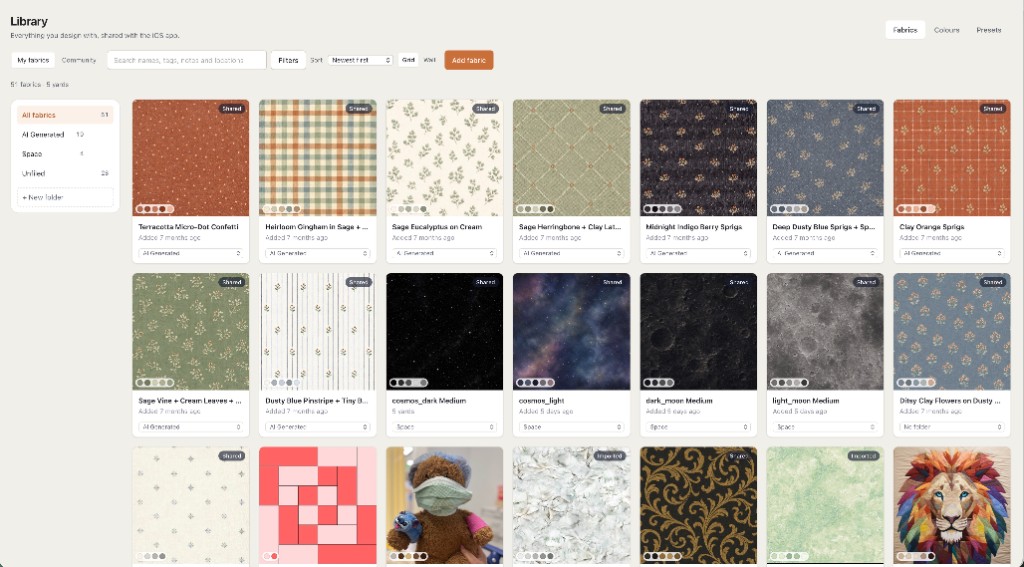
- Choose a background role first. One calm field makes accents readable. Photograph that bolt in the studio; free allows two fabrics as photos plus solids for the rest.
- Limit accent count. Two or three accents beat seven heroes fighting. Assign accents to block parts that repeat so the quilt reads from across the room.
- Check value, not only hue. Navy and black both read dark; yellow and cream both read light. Squint at the canvas layout — if shapes disappear, fix value before you buy more print.
- Read yardage while you choose. When colours settle, the fabric total should reflect those roles. Pieced points may need foundation paper piecing sheets; choosing colours happens before you print papers.
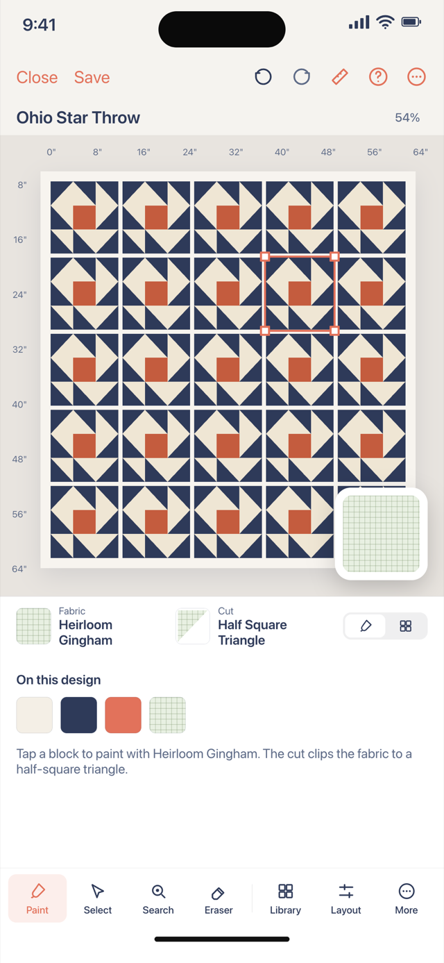
Turn choices into a studio plan
Open the studio, set a size, stamp a block or grid you already like, then assign roles. Swap the background photo first — most colour regret is a field that was too busy. Replace one accent at a time so you can see which print caused the fabric total to jump.
Theory articles help you name why a combo works. This how-to cares that you can sew it: contrast at seam lines, not only in the fabric store under LED. The palette planner page names roles explicitly if you want that checklist beside this narrative.
Save one saved quilt on free when the colours are good enough to cut. Audition more in the tab, but only one plan persists without upgrading. Per-fabric charts and binding rows are subscription; the colour geometry on screen is not a different product tier.
Common colour mistakes the canvas catches
Every print is medium value — the quilt turns to mud at a distance. Fix with a light sashing role or a dark border planned on finished size, not pinned on later.
Too many large-scale prints in adjacent blocks — the eye never rests. Repeat one print in a single role (binding, inner border, cornerstone) to unify.
Choosing colours without layout — you buy yardage for a nine-patch when you meant a log cabin. Pick the layout first in quilt layout software, then run this colour pass.
If two bolts both must stay, make one the background and the other the accent — not neighbours in every block. The studio will show you when that rule breaks.