The color conundrum is what happens when a quilt solid — or a colour you were sure of — arrives warmer, cooler, lighter, or grayer than the listing. Quiltler is the place you design after the cloth is real: photograph the cut you hold and put that photo on the studio layout. This page is the buying and identifying problem, mostly for flat colors. Quilt color theory is the vocabulary of harmony and value. How to choose quilt colors is the decision order once you trust the cloth. Quilt color palette planner names roles on a layout. A screen picker is a stand-in while the mail is out. It is not a dye.
On this page
- On this page
- What the color conundrum is
- Color is the light on the dye
- Why the listing and your screen disagree
- Four kinds of flat cloth, four different misses
- What each clue can tell you
- Name the solid before you trust a photo
- How to buy the flat color you mean
- Identify the color once it is in the room
- When it is not a flat solid
- Design from the cloth you can hold
- Around color
What the color conundrum is
People blame the shop, the monitor, or their eyes. Usually all three are involved, and none of them is lying in the simple sense. Cotton does not store a hex code. A dye reflects some wavelengths and absorbs the rest. The color you see is that reflection, times the light in the room, times what a camera or an eye does with the result. Change any one of those and the name on the selvage stays put while the color walks.
Flat solids show the walk immediately. There is no motif to forgive a wrong undertone. The purchases that hurt are the ones that sit in a large field: background, sashing, border, binding that has to kiss the front, backing bought a month later. A scrap accent can be a neighbor. A four-yard background cannot.
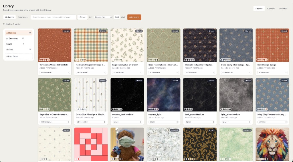
Quiltler does not turn a product JPEG into a spectral measurement. No screen does. What the studio can do, once a swatch or a cut is in your hands, is hold a photograph of that cloth on the quilt you will sew — at finished size, next to the other fabrics — so the next decision uses the cotton, not the listing.
Color is the light on the dye
Open shade or a north window is the practical reference: daylight, without a sunbeam glaring off the weave. Direct sun washes cotton out and hides the undertone in shine. A warm evening bulb, including a warm LED, pushes creams toward gold and dulls blues. Shop LEDs can be bright and still missing chunks of the spectrum, so a solid looks crisp in the aisle and muddy, or suddenly green, at the cutting table by the window.
When two fabrics match under one lamp and split under another, the name is metamerism. Eyes and cameras record three channels. Dyes reflect a whole curve of wavelengths. Two curves can add up to the same color under the shop’s lights and to two colors in daylight. You did not imagine the match. It was real under that light and false under the light the quilt will live in. Grays, taupes, mauves, celadons, gray-blues, and creams do this more than clear primaries.
Judge any solid you care about in both lights before you buy yards. Window, then the lamp in the room where the quilt will be seen. Write down which light you matched. “It matches” is an unfinished sentence. “It matches in daylight and goes green at night” is a decision. Two quilters can also honestly disagree — eyes differ — which is why a shared photo of value, below, beats an argument about the hue name.
Why the listing and your screen disagree
A product photo is a second dye job. Someone chose a white balance, the file was compressed, and your phone displayed it through a night mode, a true-tone shift, or a vivid setting. Screens are lamps. Cloth is a reflection. A phone can show a green more saturated than cotton dye can reflect, and an uncalibrated laptop can show a different sage than the phone. If the two screens disagree, the cotton is a third thing. Shop in a normally lit room. A bright screen in the dark makes every color look cleaner than it will on a bed.
Creams, ivories, naturals, and parchment are the center of the conundrum. Auto white balance is built to remove warmth, so five different creams collapse into one off-white chip. Navies, charcoals, blacks, and eggplants collapse the other way: shadows crush, and a red-undertone navy and a green-undertone navy both post as near-black. On the bed they are different fabrics.
Grayed colors — sage, dusty blue, putty, mauve — are where cameras are least stable. A small push of green turns sage into mint or into gray. These are also the solids that make a modern quilt look considered, so they are ordered constantly. Reds go the other direction: screens oversaturate them, a brick reads as a primary, and red dyes shift hard between daylight and warm bulbs.
A flat color chip, the designed square with a name under it, sorts a manufacturer’s line. It has no weave, no fold, and no dye lot. It can point you to the neighborhood. It cannot promise the bolt they will cut tomorrow. Mills retire numbers and reformulate. A color card from several years ago is a map of a line that may have moved.
Four kinds of flat cloth, four different misses
- True solid. One dye across the face. The miss is undertone, value, or dye lot. The chip left out the weave.
- Blender or tonal. From the bed it reads as a solid. In the hand it is a texture. The listing color is an average of that texture.
- Grunge and speckled solids. A range, not a point. The chip is the middle of a range you will cut through. Buy extra and choose the value you meant.
- Shot cotton. Warp one color, weft another. Tilt the cloth and the color walks. One straight-on photo is one angle of a moving target. Buy the shift on purpose. A flat match is the wrong job for this cloth.
What each clue can tell you
Use the chip to sort a line, the photo to see weave, and a swatch cut from the selling bolt to decide. The columns are clues, not a score.
| Feature | Color chip | Shop photo | Bolt swatch |
|---|---|---|---|
| Creams | Several creams, one beige | Warmth often removed | Undertone in your light |
| Navies | A near-black square | Shadows crushed flat | Red or green undertone |
| Grayed greens | A cleaned-up sage | Chroma pushed too high | Dusty or mint in daylight |
| Dye lot | The color name only | Same photo all year | Cut from the selling bolt |
| Shot cotton | A single average | One camera angle | Color walks as you tilt |
A manufacturer color card (Kona, Bella Solids, Pure Solids, Painter’s Palette, and the other solid lines) is a physical map of the line. Carry it to a window. Then still swatch the shop’s current bolt: the card and the lot on the shelf can differ.
Name the solid before you trust a photo
- Hue. The family: red, blue-green, yellow. “Sage” is not a family. Green is.
- Temperature. Warm, toward yellow or red, or cool, toward blue. A gray almost always leans.
- Value. Light, medium, or dark. From across the room this is the color that matters. Rank a stack from 1 (lightest) to 10 (darkest). Neighbors about one step apart melt together on a bed.
- Chroma. Clear, or grayed. Grayed solids are the ones screens invent. Clear solids are easier to recognize and harsher in a large field.
- Undertone. Lay the solid on white paper and on a warm cream. The direction it kicks — blue-red or orange-red, green-gray or yellow-gray — is the undertone. Search with that sentence, then confirm with cloth.
How to buy the flat color you mean
The protocol is short because the expensive mistakes are repeated ones: matching a memory, matching a hex, or adding a yard from a later bolt.
- Name the job Background, binding that must meet the front, backing, scrap accent. Binding and background show a near miss as a continuous line. An accent buried in a block can be a neighbor.
- Shop the cloth photo Prefer a picture where you can see weave and the shadow in a fold. Treat a flat fill as a label. Turn off night shift and vivid mode. Open the listing on a second screen in daylight. If they disagree, trust neither.
- Swatch the selling bolt Order a swatch from the shop that will cut the yardage, so the sample and the bolt are the same lot. A color card gets you to the right name. The swatch is the color. Read the return rule first. Cut yardage is often final sale. A swatch costs less than four wrong yards.
- Judge in both lights Lay the swatch on fabric you already own. Look in open shade or a north window, then under the evening lamp. Include a piece of white paper in any photo you take for yourself. If the paper looks yellow, the camera added warmth the cloth does not have.
- Buy the lot once Four yards means four yards from one bolt in one order. A yard added next month is a new batch. The color name does not freeze the dye. Ask them to cut from one bolt, and keep the selvage with the number.
- Bracket the creams For white, ivory, natural, and parchment, order the color you think plus the warmer neighbor and the cooler neighbor as fat quarters. Commit yardage to the one that survives your room, from that shop’s current bolt.
Identify the color once it is in the room
Value first. Squint, or photograph the stack and remove the color, and keep that black-and-white as a copy so the original stays a color reference. Two solids that look like different hues in a listing and the same gray in black and white will merge on the bed. A red value finder — quilters know the Ruby Beholder — or a green one does the same job through plastic. Hold it to your eye, not flat on the cloth. Red filters make reds read too dark, so use a green filter on reds. Green filters fail on greens, so use red on those. Overlap both for a multicolor print. A desaturated photo dodges that bias, which is why many quilters prefer the phone for value and the filter when their hands are already in the stash.
Then isolate the spot. A hole punched in neutral gray paper lets you see a solid without the print beside it shouting. The same gray looks warm next to blue and cool next to orange. That is simultaneous contrast, and it is why a solid “changes” when you move it from the focus fabric to the background. Judge it in the neighborhood it will actually have.
Then distance. Step back, or shrink a photo of the stack until it is quilt-sized in your hand. Thumbnails do this by accident. The usual lie in a shop photo is chroma, not value: too clean, too bright, too separate. If the color only works at swatch size, it will not be the color of the quilt.
For shot cotton and anything with a sheen, tilt it. If the color walks, no single product photo can stand in for it. Record the manufacturer’s color number and the name together. Names get reused. The number, the line, and the year you compared the card are the note you can reorder against — and even then, the new bolt is a new lot.
When it is not a flat solid
The same physics shows up as soon as the cloth is more than one dye. A print’s color, from across the room, is usually its background value, not the flower you noticed in the zoom. A listing titled pink may be a green quilt. The dots on the selvage are the designer’s intended solids — a better shopping list than the thumbnail. Small checks and tiny dots optically mix: from the bed they are a third color, the average of the yarns. The zoomed photo and the quilt are describing different objects.
Batiks move inside a single yard. One end can be lighter. Buy extra and cut the value you meant. A precut is a slice: a jelly-roll strip is a narrow cut of one part of the print, and the collection photo is the whole story. Thread is another swatch. Match it by a line of stitching on the solid, under the room’s light, not by the spool in your hand. Backing bought later is the conundrum again, on the largest piece in the quilt.
When you photograph a finished quilt to show or to sell, you are now the shop. Daylight, no vivid filter, white paper in the frame if you want the picture to be a reference, and the solid’s line and color name in the caption. Your JPEG will still shift a little. The name gives the next person a better start than the picture.
If two creams only agree on your phone, they do not agree. Bracket them with the warmer and cooler neighbors, or go to the bolt. A hex code will not settle ivory.
Design from the cloth you can hold
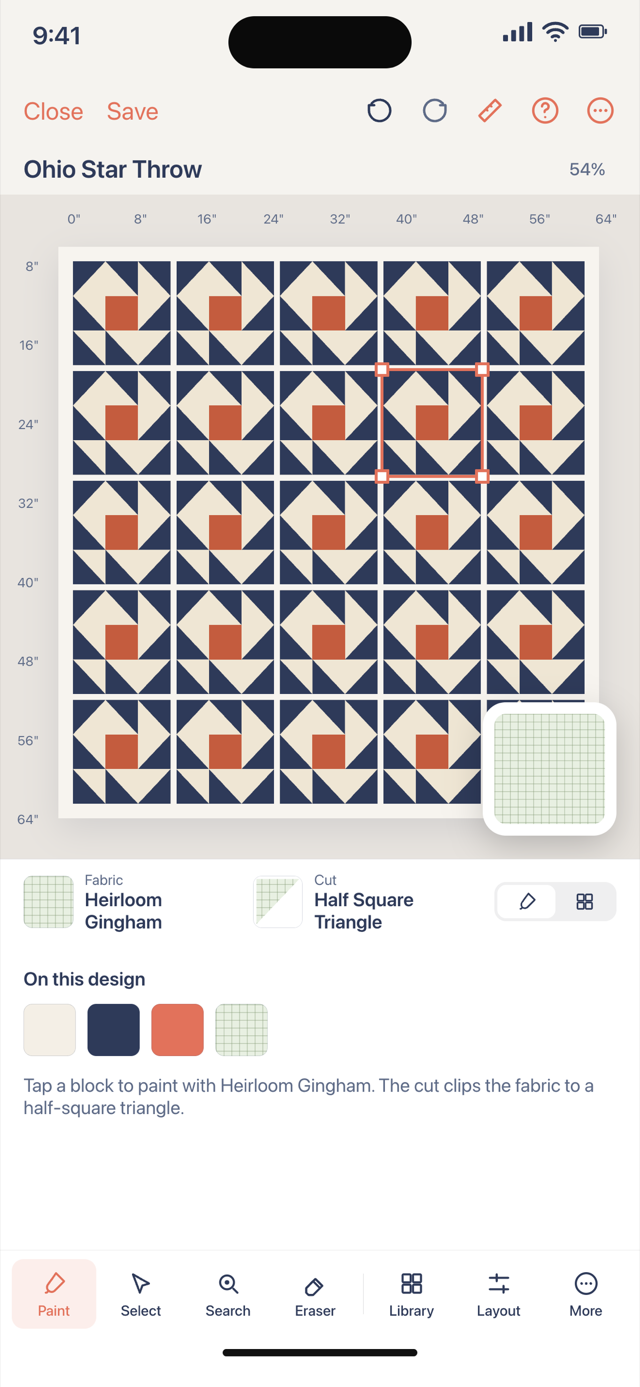
Once a swatch or a cut is in the room, photograph it in the light you judged it by and design with that photo. Roles on a real layout, at finished size, next to the other cloth: that is the point of the studio. A solid color on screen is a stand-in for value and placement while you wait for the mail. Replace the stand-in when the cotton arrives.
Free accounts keep one saved quilt and two fabrics as photographs, plus solid stand-ins for the other roles. Spend the two photos on the background and the print that has to live with it — the pair where a wrong undertone ruins the top. The filing cabinet for more photographs is the quilt fabric stash app. Yardage for the solids you commit to lives with the pieces, on quilt yardage from design.
Theory, roles, and recoloring are the neighboring pages: quilt color theory, how to choose quilt colors, quilt color palette planner, and quilt coloring software. When those solids are paper-pieced, foundation paper piecing sheets print from the same layout after the colors are settled. The wider studio is quilt design software.